Getting back in the game. The next piece I'm attempting is to figure out and improve on my modeling skills. The car engine is a V12 lamborghini engine, but due to lack of high quality and informational photo references, some of the parts have to be improvised. I'm only intending to go for a hi-poly only finish.
My 3d Blog
Tuesday, 2 December 2014
Sunday, 22 June 2014
One month benchmark!
It's been one month since I started my first game job ever, a temporary position at Piranha Games, and I feel like writing some thoughts about my experience thus far. Some of these include work ethics, what it's really like to be in the games industry, and things I learned.
It probably has to do with the fact that everyone here is doing what they're passionate about. Because of this, everyone is really nice, outgoing, and welcoming. I could claim that I've been in quite a variety of work environments in the past, and this industry is really quite unique. There are no work politics, ego, or any bs animosity that my certain past workplaces had between people just because they didn't have anything else to do.
I have become more interested in people in general. There is a good book called How to Win Friends & Influence People by Dale Carnegie that explains in order to be more likeable you should be genuinely interested in people. This advice is very applicable to the professional world, and especially the games industry. Everyone is doing and have done cool things, so there is always something new you can learn from talking to people.
On the topic of work ethics, I had a sense of largely how an art role is supposed to operate going in, but there were obviously some things I had to learn about being in the workplace I had to pick up on. As much as everyone is welcoming and would like you to ask questions, people are still very busy, so I wouldn't want to bug people all day long. It just comes down to being independent, yet curious and interested in picking people's brains, and be respectful of their time and wisdom. For example, as an art role I thought the objective was to make things and iterate and keep bothering the art director to review it until he's satisfied with your work. This might not be the best case. As an artist you have to be critical of your own work, make revisions you determine to be right, and decide for yourself when it is finished.
It is a tendency of human nature to expect a list of clear and concise instructions on exactly what to do. That is not how creative work operates. No one has the time to take of you, you're an adult, and you are given the freedom in this field of work to determine what works best.
For process I am constantly trying to find ways to work faster and achieve results faster. That may be using more hotkeys to get functions done quickly, photoshop actions, etc. At the end of the day however results are what is most important. Hotkeys and macros and automating workflows are the technical side of getting things done, and the other side is artistic vision, design sense, and the kind of knowledge one needs to possess in order to achieve results.
Some of the guidelines I've come up with throughout my learning through practice, on the topic of texturing, are:
1. Nothing in life is ever a flat colour. And this applies to all texture types and all materials in the world. A red pillar is never pure red for example, there are holes and imperfections on the surface, miscolorization, oxidation, layers of stuff in the concrete, etc. Different areas of the surface of an object are exposed to different things, like sunlight or lack of lighting, dirt pile-ups, that changes the colour. These imperfections are everywhere, even in new things, and make them read more realistically.
2. Accent the edges and darken the creases. A way to highlight, give emphasis, and sharpen an asset.
3. Build dirt passes to darken closed areas and sunbleach passes to lighten open areas. In essence it's similar to the above principle. It's nice to give emphasis to different areas and make a piece more dynamic.
5. Start with base material first, then layer up everything else. This is fairly intuitive at this point.
Tuesday, 8 April 2014
Modular train tracks
So a really dumb thing I did. I made this post in preparation for going to a hiring event to talk to Relic Entertainment. Except when I actually got there and I was talking to a recruiter the place was really loud and I lost my train of thought for a while that I forgot to show him this post! It's funny looking back it's not really the venue's fault but I think the organizers didn't anticipate this many people would show up at a restaurant with only so much space. It was still a great event though and I'm glad it happened, so I can't complain. I'm going to explain what this post was about.
Targeting one of my favorite games from Relic, Company of Heroes 2, I was wondering what I could do to stand out from the rest of the candidates when talking to them. So I thought I would highlight a possible concern in the game and do a quick demo of how I would address it. A quick enough problem I saw in the game were the train track assets they had placed in the maps. This is a static asset, meaning they're placed into the world to increase the sense of believability, but like most objects in a CoH map they're destructible and would have different versions of the mesh after they blow up. The destructibility part of this asset is not the objective here.
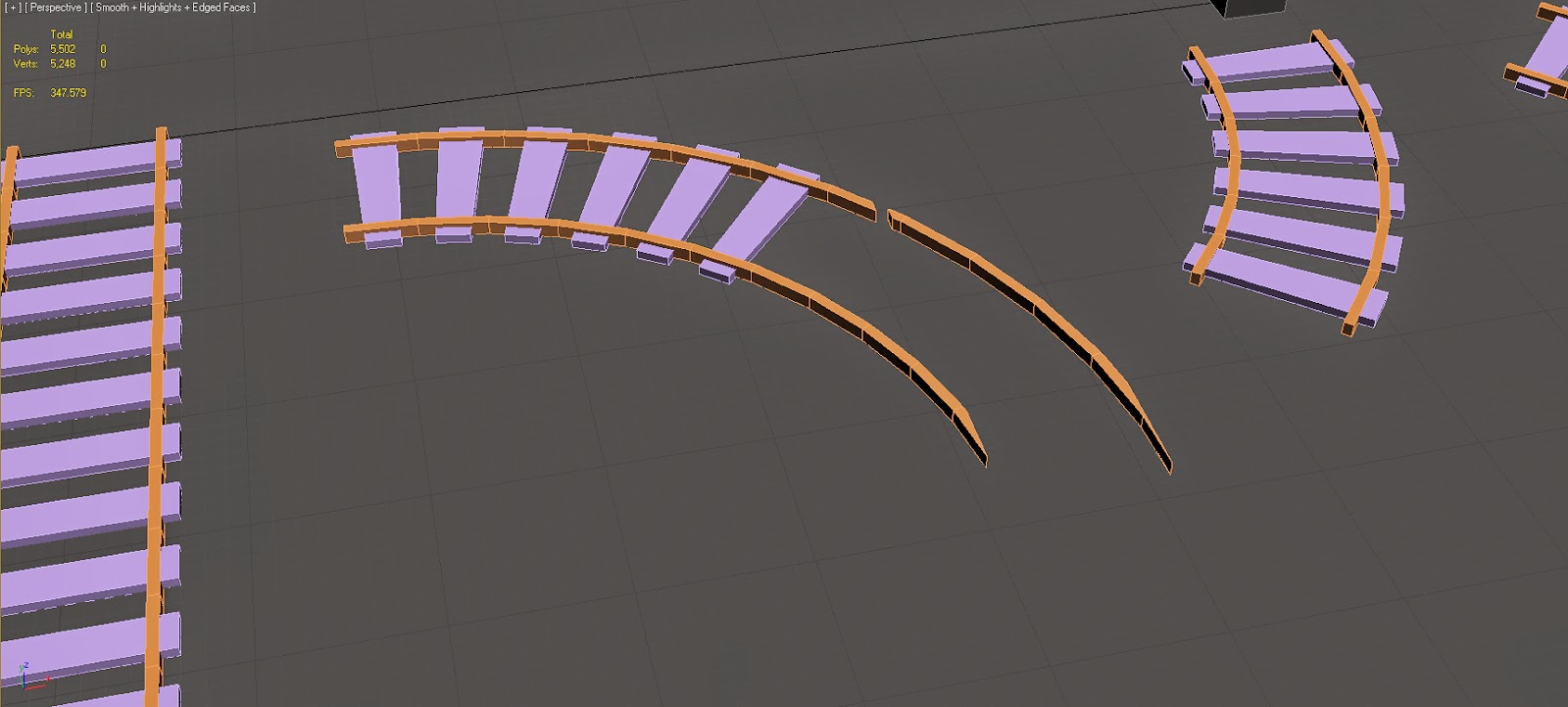
The quick problem I highlighted was that modeling was kind of crude. As part of being a modular asset, a model is meant to be reusable so on the level of optimization they save memory, while still making the game look good. In the 2 images below the merging segments are protruding each other. The wood planks of the curved segment are just placed onto the straight piece, which makes for an unrealistic area out of an overall realistic and believable game world. The other thing is some of the planks go into the terrain, like on the right side of the 2nd image. To address this is only a matter of a bit of modelling.
I used some reference photos from google to look at how rail tracks work, and how miniature train set pieces are assembled. I was most interested in the merge piece that junctions 2 paths into one. The actual track pieces are very simple to model, they're just a bunch of boxes in 3ds max lengthened and shortened. The interesting part is creating the angled variations, 45 degrees here to keep things simple, and then deleting and merging some faces to make it fit with a straight track piece with no protruding polygons. Doing all of this while keeping things snap to grid.
With everything built using a modular mindset, the track pieces come out alright and I can build any track configuration easily in Unreal Engine 4. If I put some work into doing the UV's, the whole track would only need one texture map.
Tuesday, 25 March 2014
Updating progress on the arch, and Unreal 4!
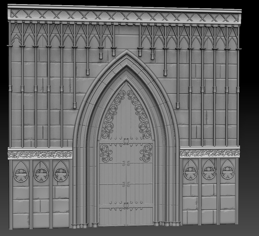
Since the announcement of Unreal Engine 4 going into a subscription model, it is now one of the most affordable professional quality tool available. I immediately snatched up a license last week and started playing with it. I would like to render the arch in the engine and I hope it will turn out great. Here's the finished bake and making progress on texturing in a complete pbr process. Rendered in toolbag 2.
Friday, 31 January 2014
gothic arch
In process of creating this arch, ran into some tough times along the way so progress is slow. Main issue I'm having as far as this asset goes is deciding how to approach decos.

PBR test
Subscribe to:
Comments (Atom)


